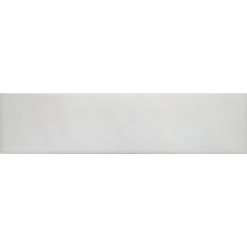
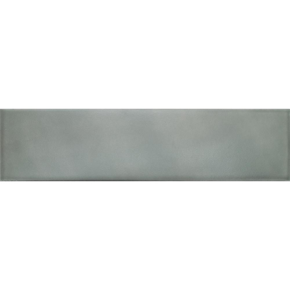
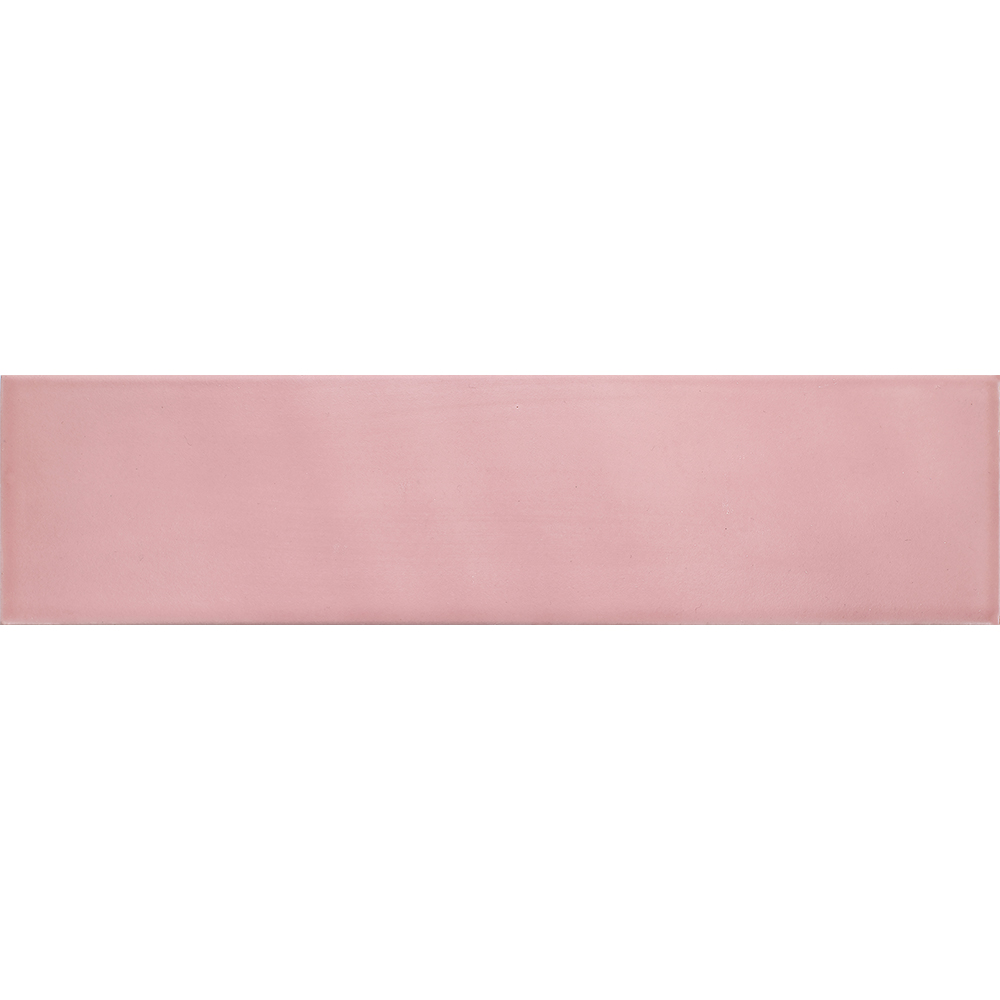
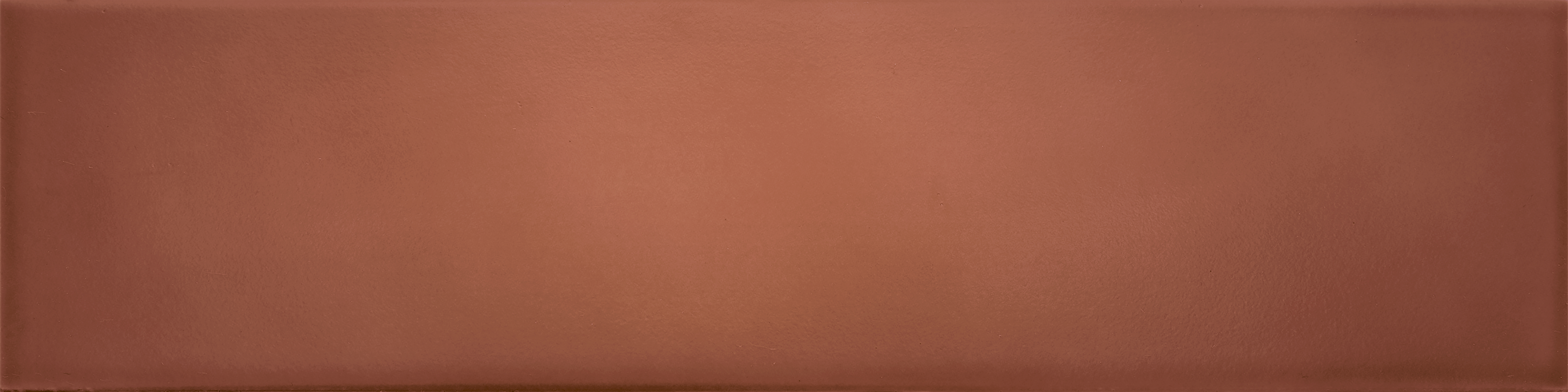
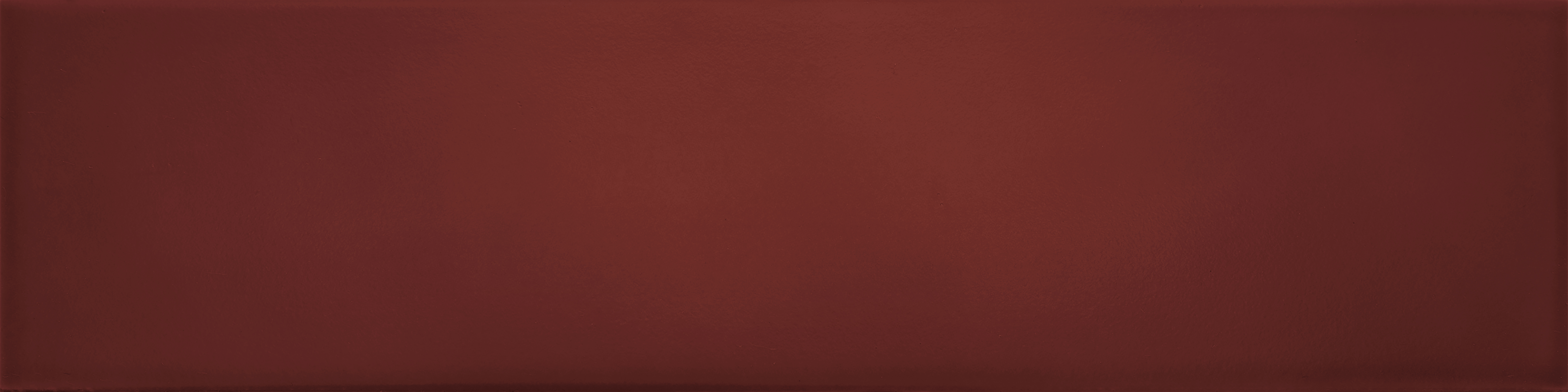
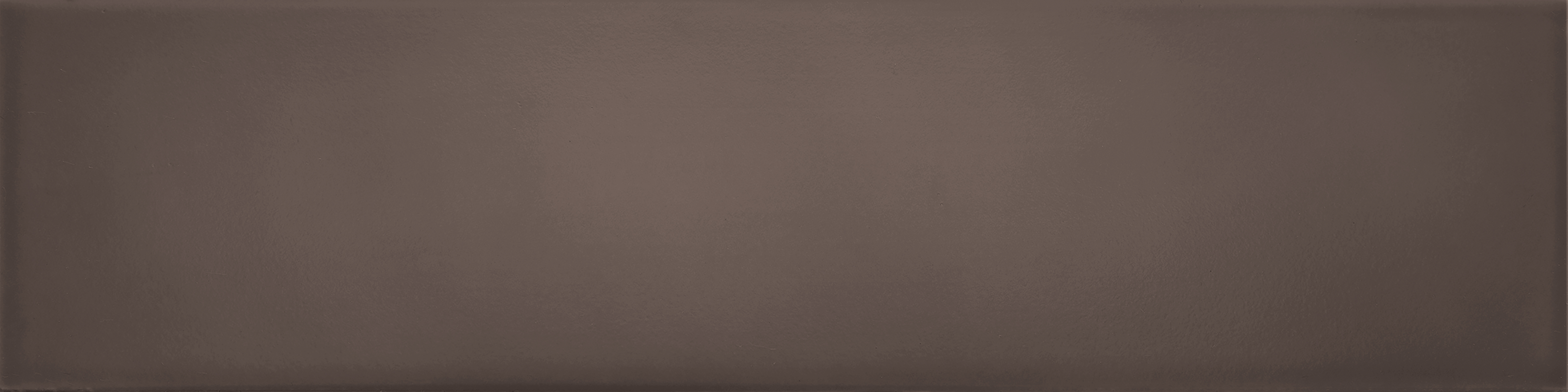
The Ombré Series gains new warm and inviting earthy tones, expanding composition possibilities within its nostalgic and retro aesthetic. The new colors — Clay, Tile, Carmine and Brown — bring chromatic depth to the collection, exploring warm nuances reminiscent of handcrafted and natural materials. With a matte finish and the English Brick format (7.7×30.5 cm), the tiles reinforce the vintage identity of the line, enhancing creative layouts and rhythmic surfaces. The new colors are suitable for both residential and commercial environments, serving as focal points or subtle accents in projects with personality and timeless charm.